Camunda changed categories. Process orchestration became agentic orchestration, and the shift did not start in a brand meeting. It came out of analyst reports, competitive pressure, and a product roadmap. I did not name the category. I built everything the market could see.
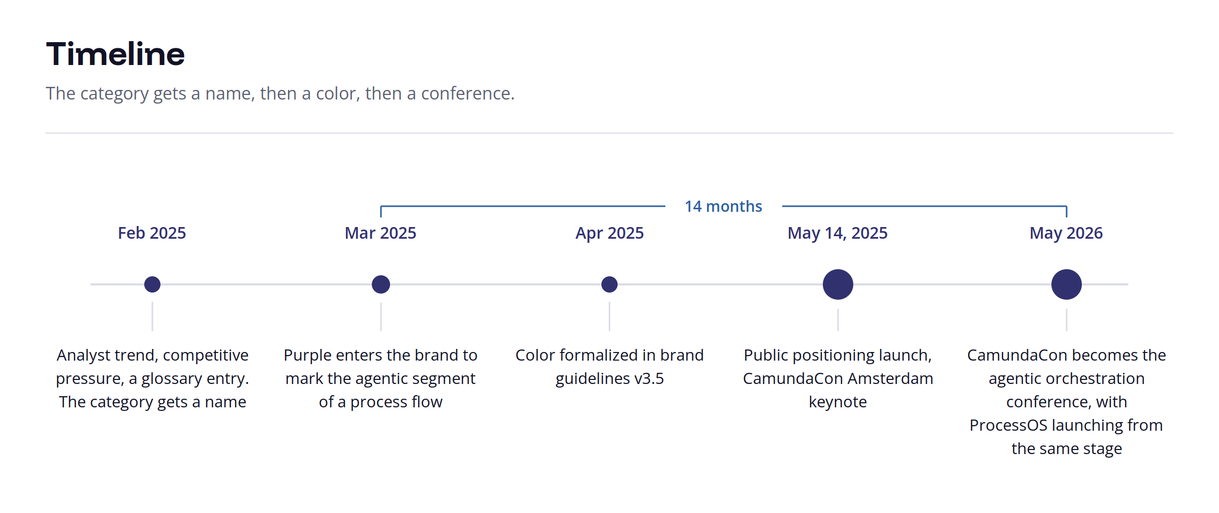
Timeline: 14 months from one web graphic to a conference built on the same color
The Real Problem
The category had a name in February. It had no face until March.
A glossary entry is not a repositioning. Analysts, product, and sales can all agree on a word while every surface a customer or prospect touches still argues the old thing.
Five Chapters, One Question
Before anything got designed, something got redefined. The same question ran through all five, and the surface got bigger each time.
A diagram. What does agentic orchestration actually mean?
A campaign. What is this ad arguing?
A video. What is this script actually saying?
A conference. What is this event?
A company's brand. What is this project?
Chapter 1: A color with a job
The purple was my idea, and it did not start as a brand decision. It started as a legibility problem inside one web graphic.
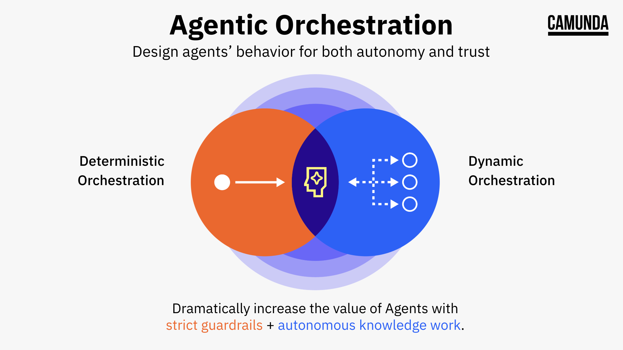
We needed to show a process flow where part of the sequence runs on rules and part of it runs on judgment. Same diagram, two kinds of behavior, no way to tell them apart. Orange marked the deterministic path, because orange was already the Camunda signature. Blue marked the dynamic path, because blue is how this category draws AI. The agentic portion was the overlap, so it took the color of the overlap.
Then I took the working diagram and threw most of it away. A process flow explains agentic orchestration to someone already reading closely. A keynote needs the idea to land from the back of a room in about two seconds. So I compressed it into two circles and an overlap, which is the version that went on stage and the version everyone has used since.
Deterministic plus dynamic equals agentic. The color is the definition
That is why it held. It was mixed from what the brand already owned rather than imported from outside it.
Three decisions came with it:
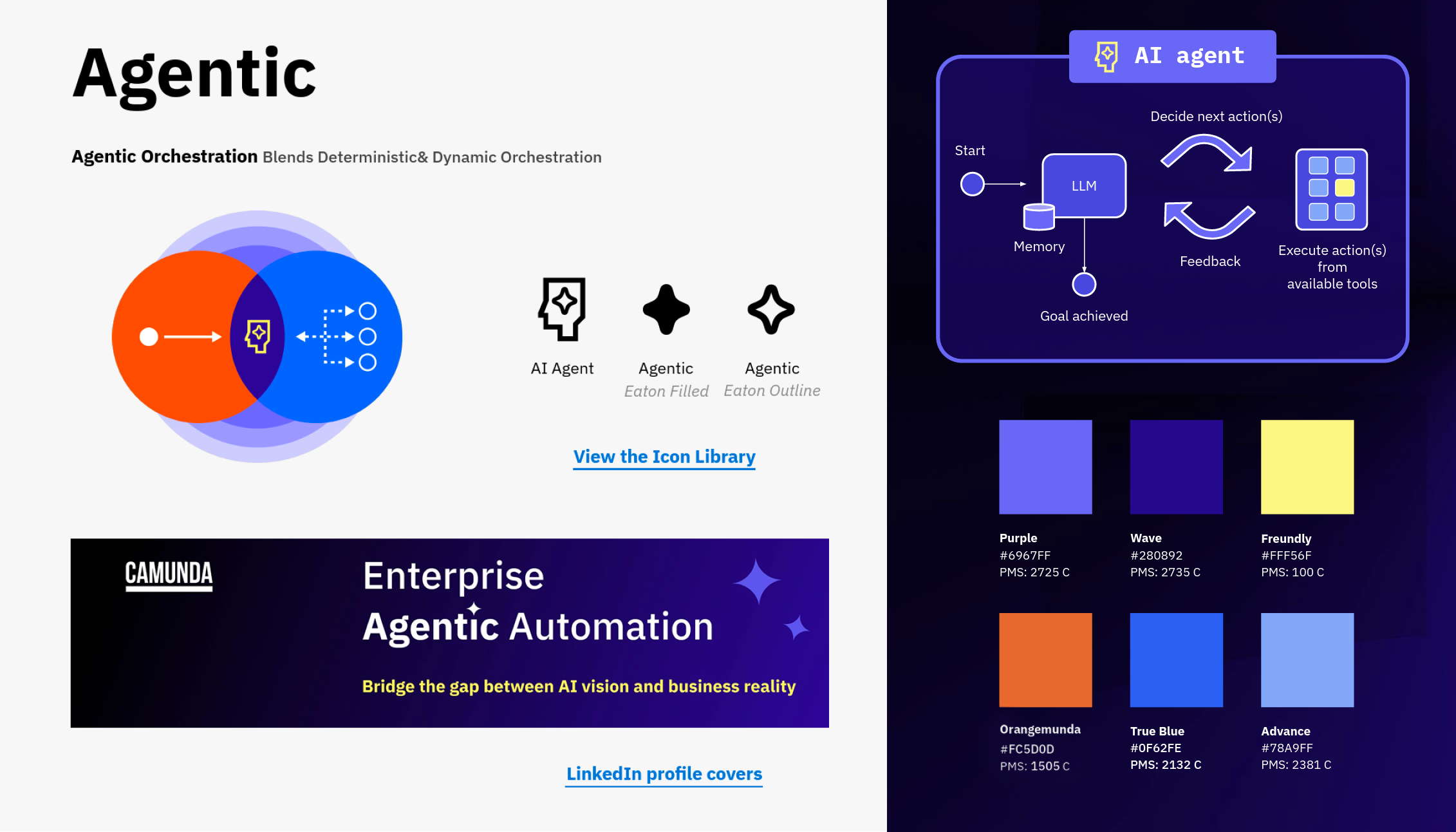
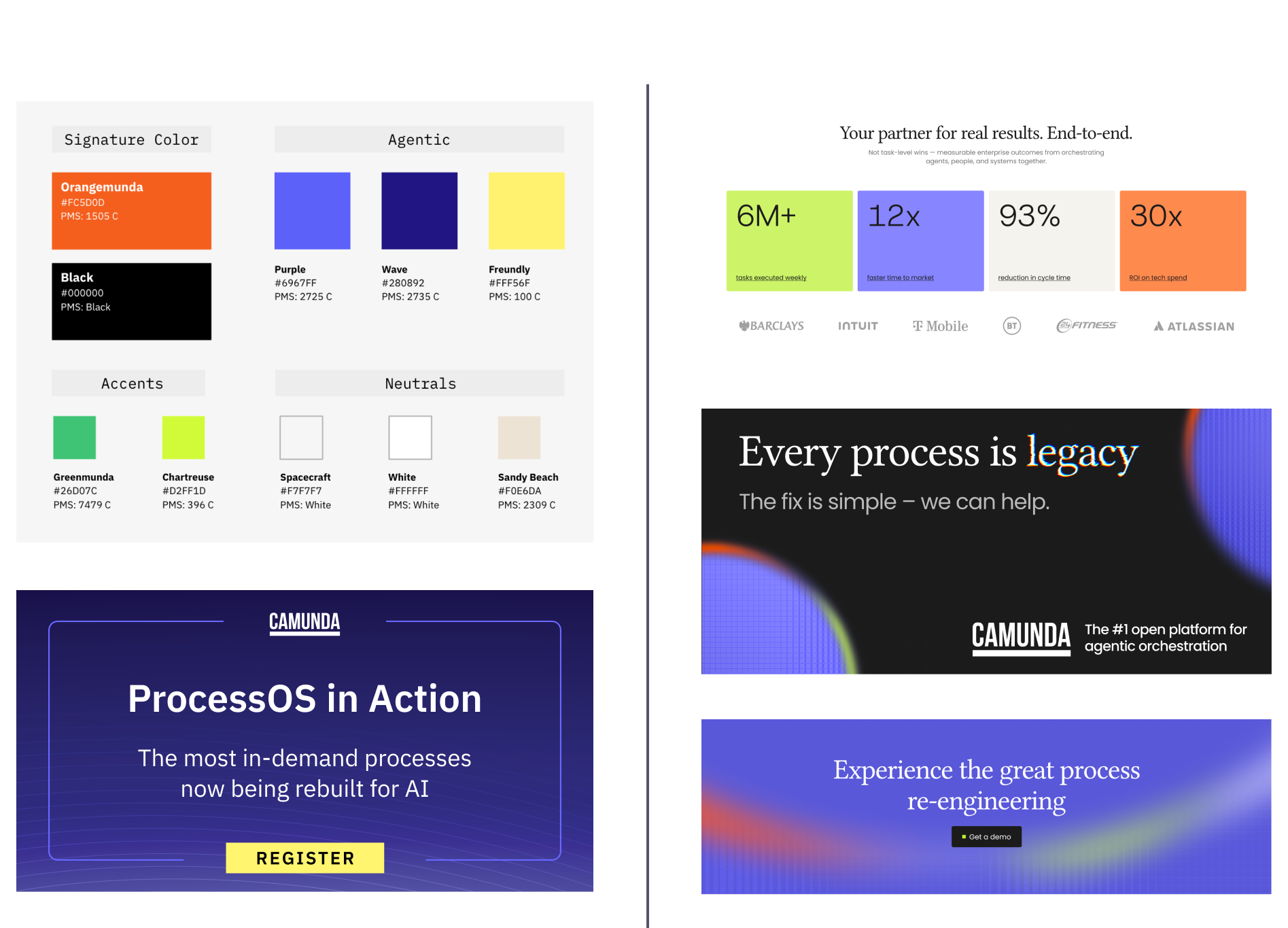
Purple was added to the palette, not swapped into it. Wave #280892 for depth, Purple #6967FF for the active state. Orangemunda #FC5D0D remained our signature color.
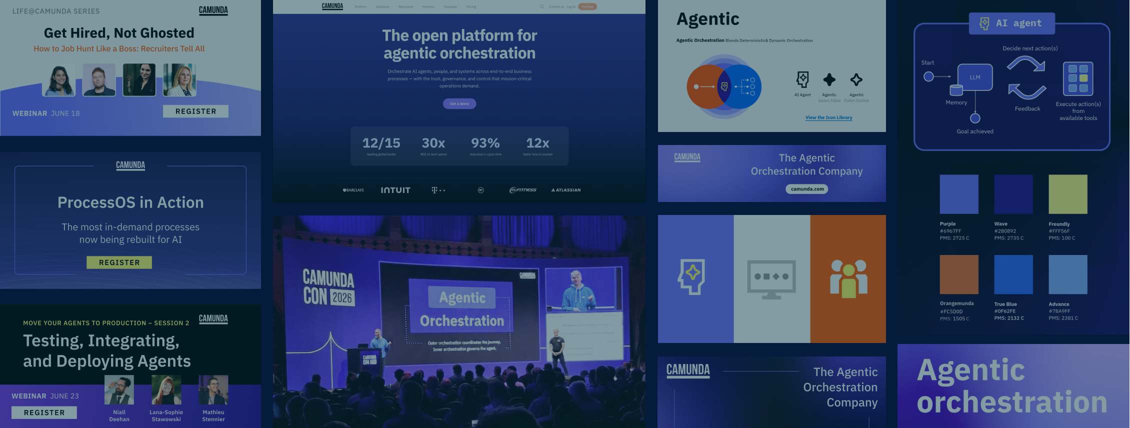
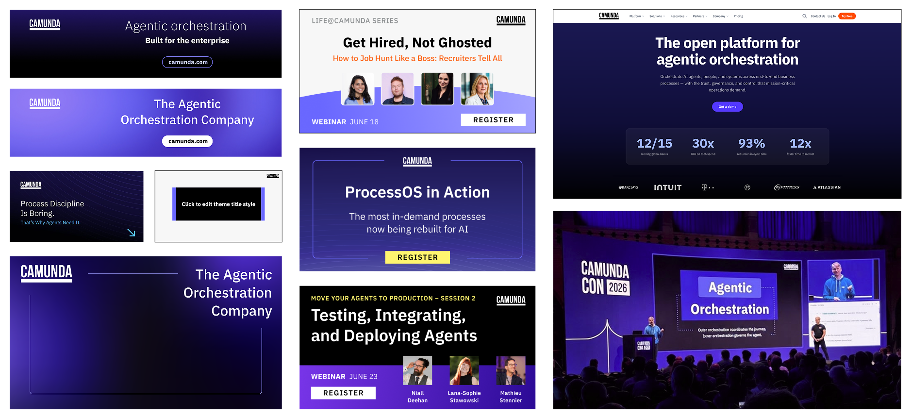
The background gained range. Black stayed primary, but black-to-purple and purple-to-purple gradients entered the system, and solid purple became usable on its own. What had been two grounds became a family, spent deliberately on ads, CamundaCon, keynote moments, the homepage, webinars, and social. The agency later picked the gradient up and took it somewhere else entirely.
Yellow entered as the accent that survives on purple. Freundly #FFF56F, named after our CEO, had higher contrast and better balance against the new purple background than orange did.
Formalized in brand guidelines v3.5, April 2025, with names and PMS values so it could go to a booth or a banner without a second conversation. Five icons came with it, including the four-point signature shape drawn by a junior designer on the team. It is named after him. My decision was not what it looked like. It was that it was good enough to enter the system and that it kept his name.
Agentic palette and key visuals documented in Brand Guidelines v3.5
Nobody asked me to take the purple past that one diagram. I proposed it.The argument was that a category claim made in one graphic is a graphic, and a category claim made everywhere is a position. Over the following months the agentic palette went into the slide template, the website, the banners, the webinar system, the booths, and the event identity. Its share grew through use rather than decree, which is the only way a color earns a brand.
One added hue across the system.
Chapter 2: What the ads had to stop doing
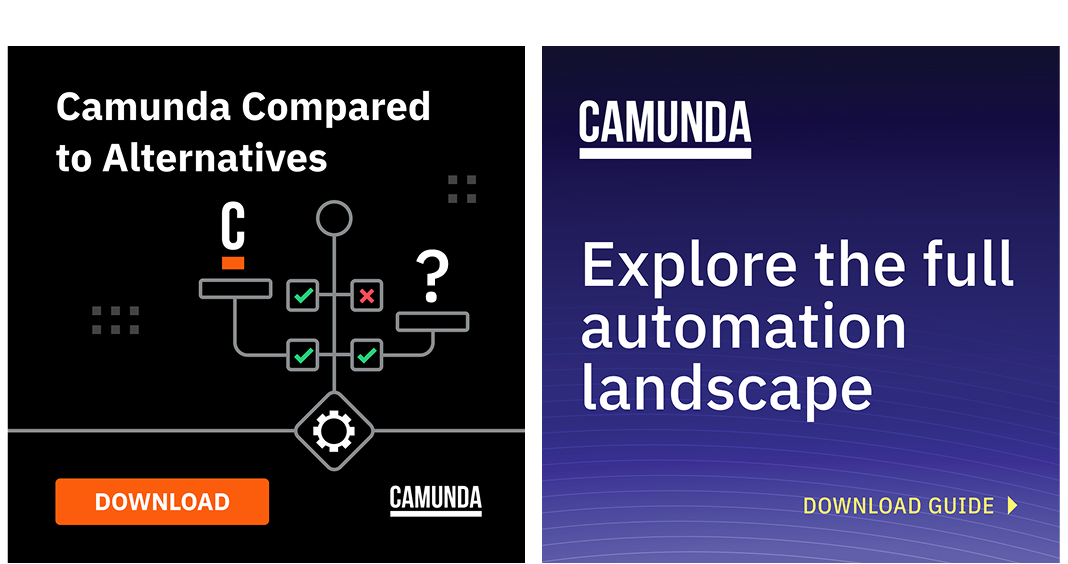
The clearest place to see the shift is one campaign before and after. Camunda vs Alternatives is our most-run comparison asset.
Before – The graphic language drew the product: process nodes, sequence flows, gateways. After – The graphic language drew the argument.
The old ads worked by showing a process diagram, which was the right answer when the product was process orchestration. It became the wrong answer the moment the category changed, because a node diagram is a picture of the thing we were repositioning away from. Drawing the old product louder does not communicate a new one.
So the illustration came out and the type and the color did the work. It is a harder ad to make. There is nowhere to hide when the headline and the background are the whole composition.
Chapter 3: Video
A script sat untouched for five days. I had three, and I spent the first one deciding what to throw out.
Six business days, idea to live
In June 2025 the CEO asked for the website hero video to address the agentic story directly. The CMO set the terms: sixty to ninety seconds, quick turnaround, and one line I have thought about since.
"This is a quick turnaround project so let's not let perfection be the enemy of pretty good." – Darr, CMO, Camunda
Our VP of Product Marketing wrote the script that day, June 18. It was too long for the format. I proposed substantial cuts, my trims were the ones that ran, and I took the shortened script into the storyboard.
I was added to the project on June 23. First cut June 25. Final June 26, live on YouTube and the homepage that afternoon.
From the CMO & CEO, same day:
"Holy cow! I blink and you've gone from idea to reality in 6 biz days!!! Thank you all for driving this with velocity and quality!" – Darr, CMO, Camunda
"The explainer video is a massive improvement over the last one, I'm happy we got it done so fast!" – Jakob, CEO, Camunda
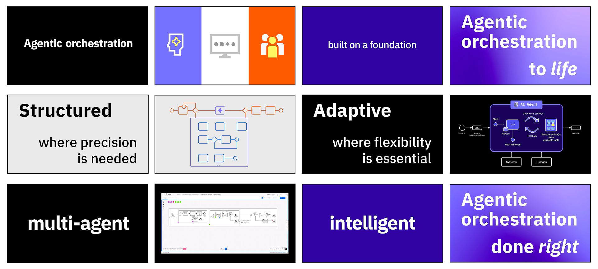
From storyboard to video frames: Black, white, purple, gradient, in rotation.
What I decided
The storyboard was rough on purpose. On a three-day turn, a polished board is a deliverable that competes with the thing it is meant to describe. I brainstormed enough to lock the beats, then went into production, motion, and the edit.
Three days was possible because the palette was formalized in April, the icons already existed, and the motion behavior was already decided. There was nothing to invent. The system absorbed the deadline.
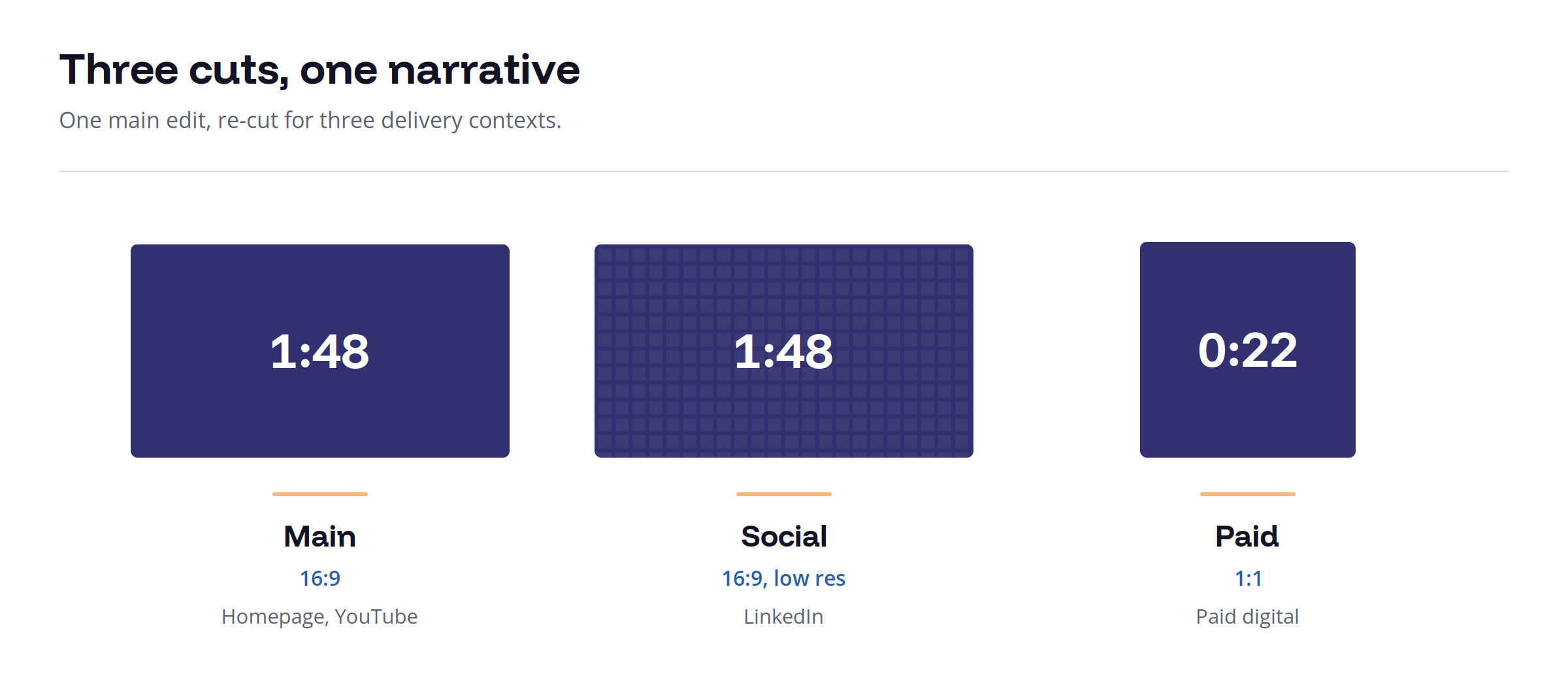
Three cuts, one narrative.
Taking 108 seconds down to 22 in a square frame is not editing. It is deciding what the argument actually is. Whatever survives the cut is the thing you were really saying.
The middle of the video makes the same argument as the diagram from March. Structured where precision is needed, in orange. Adaptive where flexibility is essential, in blue. The color logic set inside one web graphic three months earlier was still carrying the explanation, which is the only reason a three-day turnaround produced something coherent.
4.6
M
views on YouTube, paid and organic.
3
video cuts, one narrative
A year later, on television
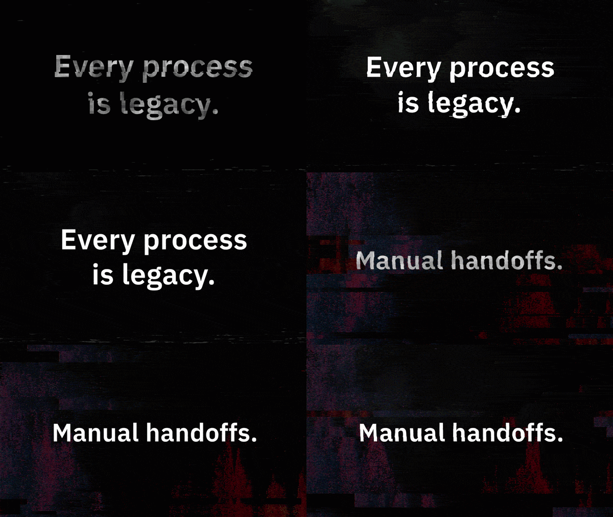
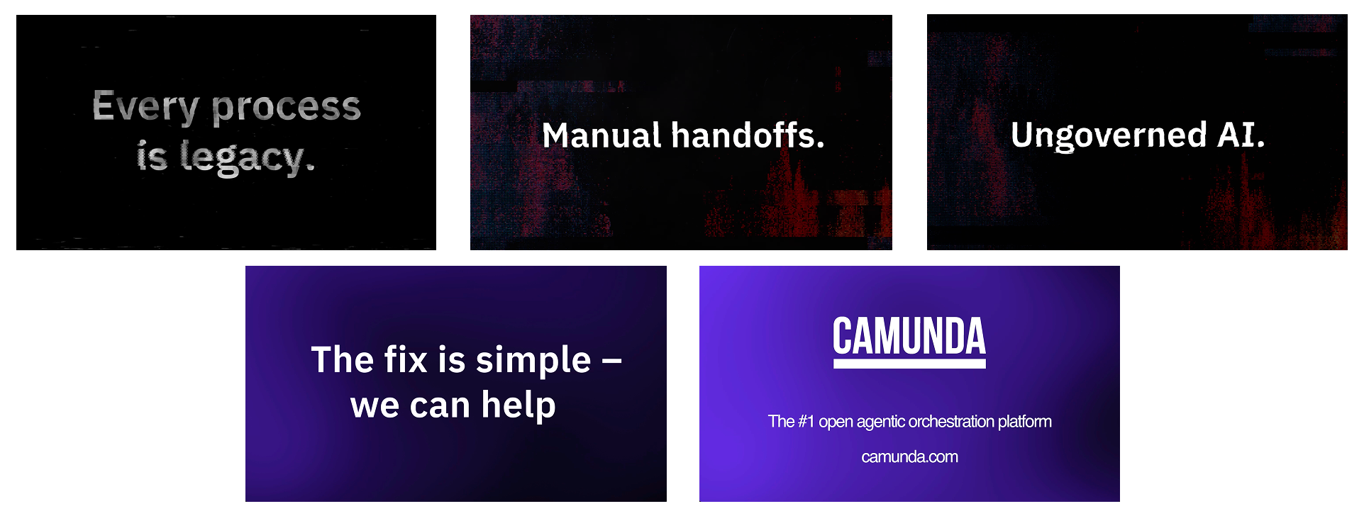
In August 2026, Every process is legacy went to connected TV. I art directed and produced it.
CTV is the only placement here with no click. Every other cut ends with something a viewer can act on. This one ends and the viewer does nothing, so the spot has to be worth remembering instead of worth clicking. The constraints run opposite to the square paid cut from a year earlier: that one had to work with the sound off, on a phone, at arm's length. This one is watched with the volume up, across a room, and delivered to broadcast spec.
CTV Art Direction
The idea was to make legacy look like what it feels like. The spot opens on degraded type, moves through datamosh and signal corruption across manual handoffs and ungoverned AI, then resolves into a clean purple field for the fix. The visual argument is the whole argument, which is what a no-click medium requires.
CTV frame sequence. Degradation to resolution.
Chapter 4: From a keynote slide to a conference theme
A category can be a theme running through the programming, or it can be the reason the event exists. I argued for the second.
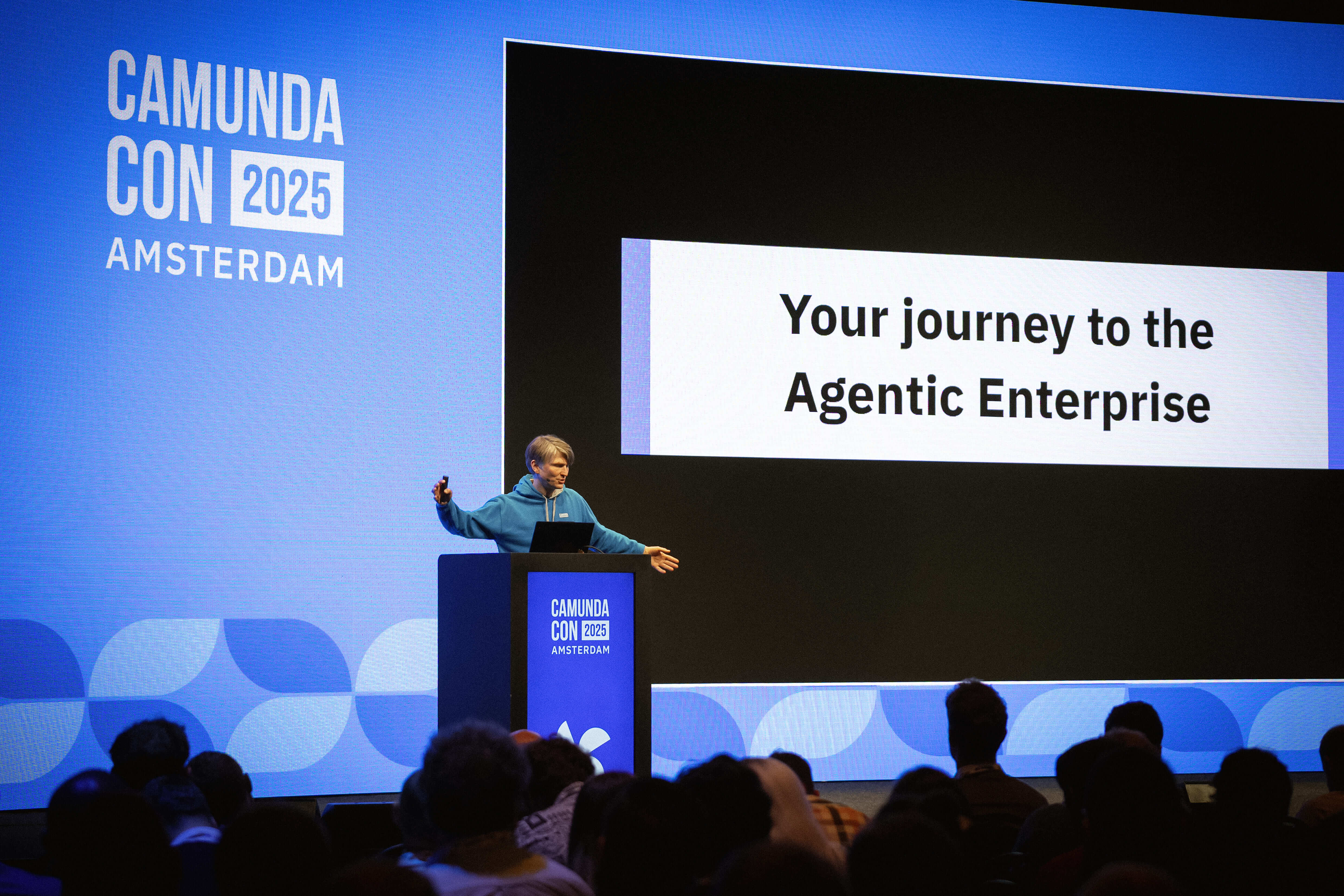
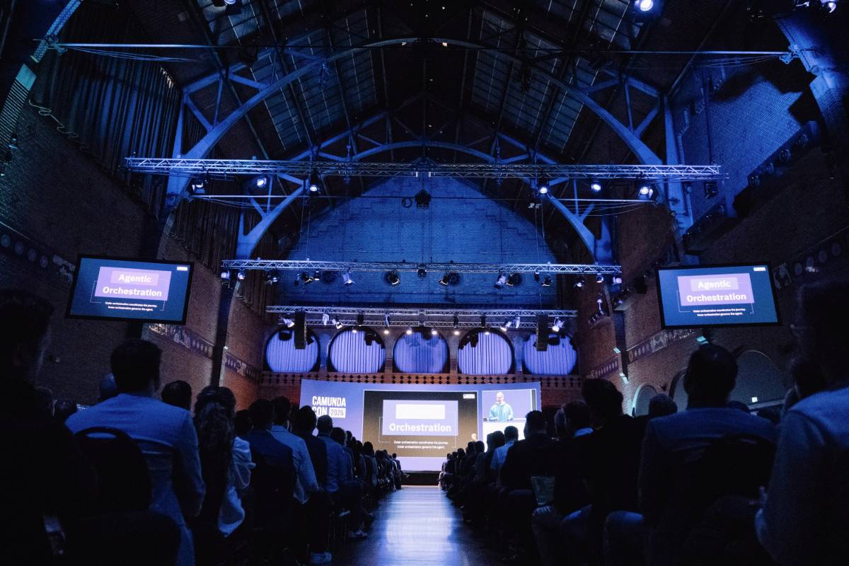
May 14, 2025. CamundaCon Amsterdam. The positioning went public from the main stage, in a keynote I designed.
CamundaCon Amsterdam, May 14, 2025.
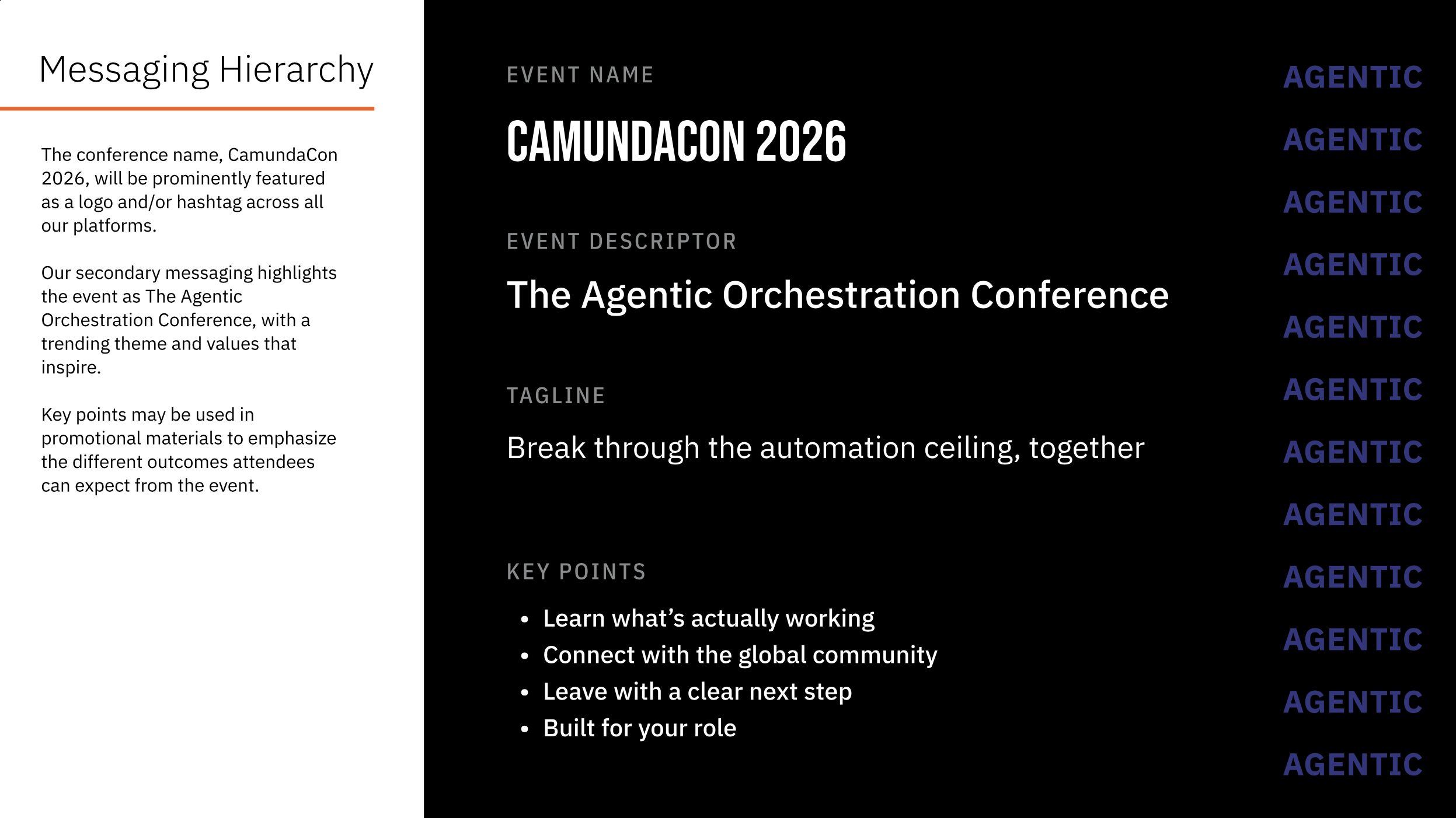
The following year I proposed making the category the event. Not a theme, and not a keynote slide. CamundaCon 2026 as the agentic orchestration conference, with the identity built from the agentic palette rather than decorated with it.
I opened the planning cycle by running the kickoff and presenting the direction to the brand and events teams, then produced it through the three-stream model in Case Study 2: in-house for the brand-sensitive work, agency for heavy production, freelance for surge.
The company doubled down from the same stage by launching ProcessOS.
The event guidelines, written to connect the conference back to the product system.
CamundaCon 2026 environment, agentic gradient at room scale.
Fourteen months from one web graphic to a conference built on the same color. A color system earns the right to run an event by proving itself everywhere else first.
See Case Study 2 for the full event identity arc.
Chapter 5: The foundations that survived
I was handed a brand refresh and argued it was the wrong scope.
The diagnosis
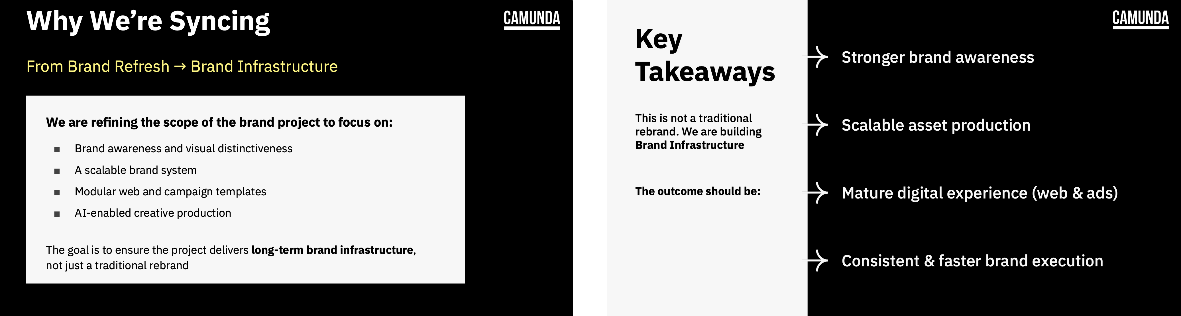
In 2026 Camunda set out to evolve the brand with an outside agency, and I was the tip of the spear on the engagement. A refresh produces a nicer-looking version of the same bottleneck. What the company actually needed was a system that let people make on-brand assets without a designer in the loop, including through AI tooling. I wrote that into the requirements and into the internal alignment deck in a line I would defend in any room: this is not a traditional rebrand, we are building brand infrastructure.
Reframing the scope before the agency was briefed.
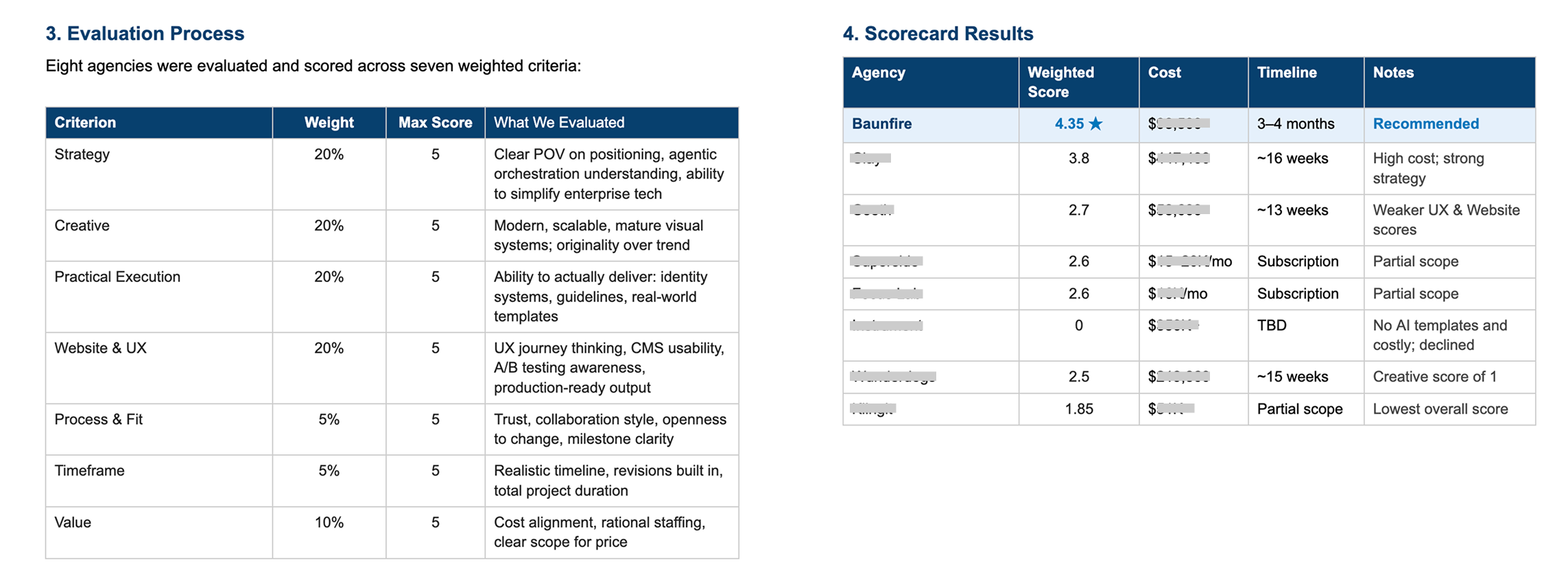
The scope I wrote covers three systems: a visual brand system evolution, a modular web design system with 12 to 15 templates and a Figma component library, and an AI-enabled creative production layer with brand-safe prompt frameworks and templates built for automated asset generation. The selection
Researched the agency landscape and built a weighted scorecard across seven criteria
Evaluated and scored eight agencies against it
Ran the outreach and the intro calls
Wrote the requirements document and the scope of work
Built the internal alignment deck and presented the recommendation
Stood up the project channel and ran communication through it
Baunfire scored the highest. We signed contracts shortly after I recommended them.
Eight agencies, seven weighted criteria.
What the brief protected
Brand identity refinement, not a redesign. Color and typography evolution with no full departure. The brief did not list colors. It set a boundary and left the rest to them. What came back was orange, purple, and chartreuse.
None of those were defaults. Each one entered the brand because I put it there, and each one entered for a reason.
2021. Collapsed a scattered palette into a single signature orange. Orangemunda, #FC5D0D.
2023. Introduced Chartreuse for Camunda Community Summit, #D2FF1D, because a vibrant developer audience expects a brand with some voltage in it.
2025. Introduced Purple as the color of the agentic category, #6967FF.
By 2026 those three were simply what Camunda looked like.
Left, the agentic system. Right, the brand evolution direction (Design: Baunfire).
An agency was hired to question everything, and the brief gave it room to change the color. It used none of that room. Three decisions made across five years came back untouched.
Case Study 1 shows a brand system that held while I was in the room. This one shows three decisions that held when someone else had the pen.
"She led the initiative to select an agency for the brand refresh, crafting very thorough statements of work, clearly defining what a successful engagement would look like, and being explicit about expectations, goals, and deliverables. She kept the internal team aligned throughout." – David, Director of Web Marketing, Camunda
Tension and resolution
The company needed to sound like a new category before it could look like one, because words move faster than systems. Product marketing had the term in February. Sales needed slides, demand gen needed ads, and the event identity was already locked.
What resolved it was making the first decision small and functional instead of large and ceremonial. One graphic. One legibility problem. A reason anyone could repeat. By the time it needed to run a conference, nobody was debating it, because it had already been quietly working for a year.
Big brand decisions land better when they arrive as the obvious extension of a small one that already worked.
Outcome
14
Months
from one web graphic to a conference built on the same color
6
Business days
from CEO request to a video live on the homepage, three of them mine
4.6
M
YouTube views
on the homepage explainer, paid and organic
3
video cuts
from one narrative: web, a social version, and a 22-second square for paid
8
agencies scored against 7 weighted criteria to select the brand evolution partner
3
color decisions
made across five years, all carried into the agency-led brand evolution
The category was decided by analysts, competitors, and a product roadmap. None of that is visible to a buyer.
What is visible is a color that explains itself, a video that shipped in three days because the system was ready, a conference built on a palette that started inside one diagram, and three color decisions an outside agency chose to keep. A repositioning is only real when someone outside the company can see it without being told.